Form Widget
Overview
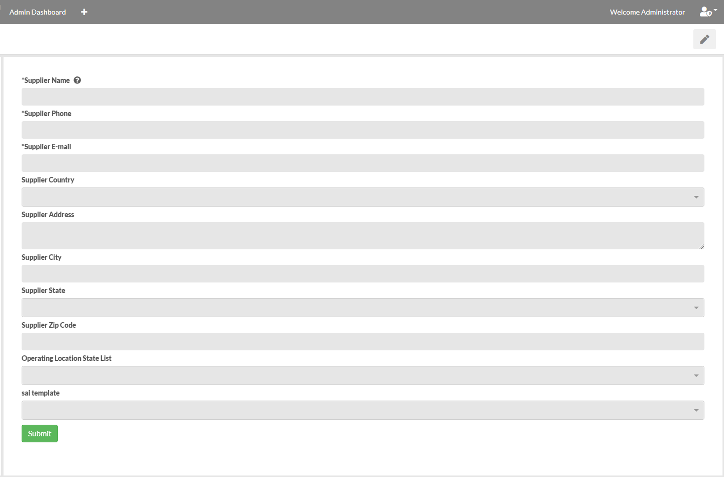
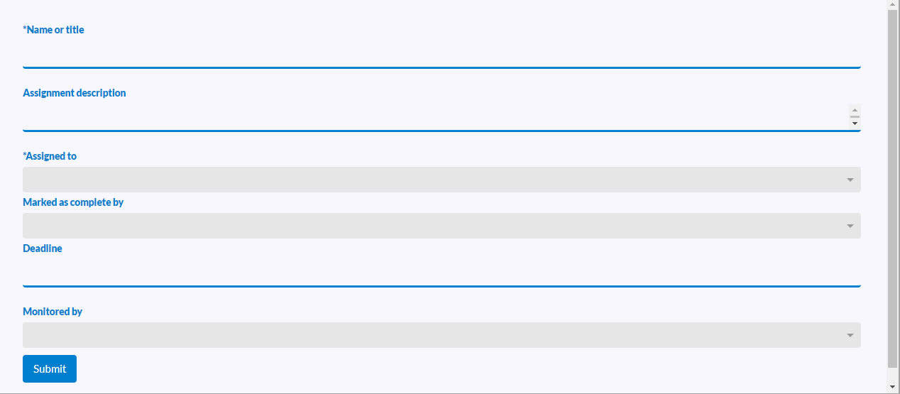
The Form widget allows external users to submit a form that creates M-Files objects and kicks off workflow, such as contact or supplier forms.
Configure Form
To configure the form, select the "Edit widget data" option. After selecting an object type and class, all properties are retrieved to dynamically create the remainder of the form. From here, the form can be modified to meet the user case.
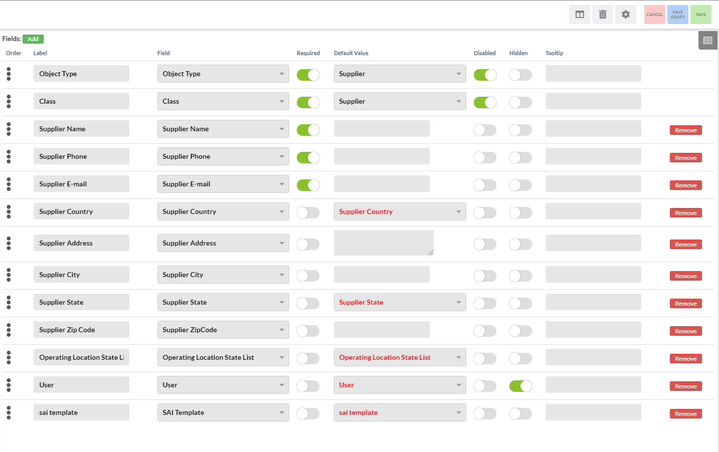
- Add - This button is used to add a new field. This field will be added to the bottom of the ordered list.
- Remove - This button is used to remove a field.
- Order - On the very left of each field, click and hold the three bullet points to drag the field up and down until the order is to your liking.
- Label - This is the label of the field that external users will see when they are filling out the form.
- Field - This determines which object property the field gets mapped to on M-Files.
- Required - This will make fields required for the external user to fill in, marking the label with an asterisk (e.g. *Name).
- Default Value - This sets the default value and will be what the external user sees.
- Disabled - This disables the field.
- Hidden - This hides the field from external users.
- Tooltip - This enables a help icon in the form of a question mark right next to the label. This is used to explain what needs to be filled in.
- Add Table - Tables allow you to create one or more additional objects when the form is submitted that are linked to the main form submission.
- Add File Upload - This adds a file upload field to the form.
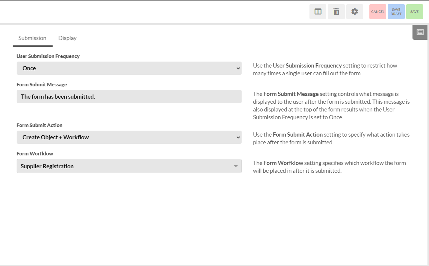
Configure Widget
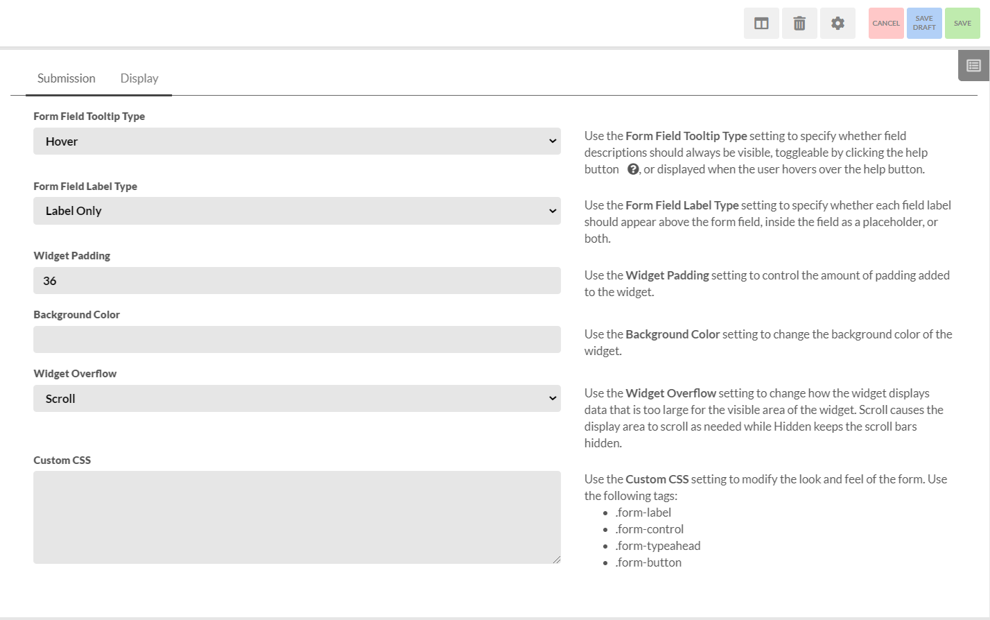
The Configure Widget option contains 2 tabs: Submission and Display.
- Prepopulate with Previous Submission - Prepopulates the form with a previous submission if one exists.
- Renew Submission Date - Used in combination with the Read-Only Submission Property to determine if a previous submission should be displayed in read-only mode or not. If the current date is before the configured date, all forms will be read-only.
- Read-Only Submission Property - A boolean M-Files property on the object created by the form that determines if the form should be displayed in read-only more or not.
- Filter by User - Determines if previous submissions should only find forms that reference the external user.
- Filter by User Property Match - Determines if previous submissions should only find forms that share the configured property with the external user.
- Parent Object Select Property - Adds a dropdown field allowing users to select which value from the property they want to be associated with the form object.
- Parent Object Display Name - The display label for the Parent Object Select Property field on the form.
- Save Drafts of Unsubmitted Forms - Enables forms to be automatically saved so values are not lost if the user's session times out or they navigate away from the form.
- Class for File Drafts - The M-Files object class that the drafts should be saved with.
- User Submission Frequency - Sets if a user is able to submit a form once or an unlimited number of times.
- Form Submit Message - The message displayed to the user after the form has been submitted.
- Form Data Confirmation Message - The message that's displayed to users as a final confirmation before the form is submitted. If no message is set, then the confirmation modal will not be displayed.
- Form Submit Action - Determines if the newly created object should be added to a workflow or not.
- Form Workflow - The workflow that the object is placed in upon form submission.
The display tab is used for adjusting the look of the form widget by allowing for customization of padding, background color, and custom CSS.
An Example of Custom CSS
.form-control {
	border: 3px solid #007fce;
	border-radius: 4px;
	line-height: 40px;
	height: 40px;
	box-shadow: unset;
	background-color: unset;
	border-top: unset;
	border-right: unset;
	border-left: unset;
	font-size: 1.2em;
	margin-bottom: 25px;
	resize: none;
}
.form-button {
	background-color: #007fce;
	color: white;
	border: 3px solid #007fce;
	border-radius: 4px;
}
.form-label {
	color: #007fce;
	font-weight: 900;
	display: block;
	width: 150px;
	float: left;
}