Search Widget
Overview
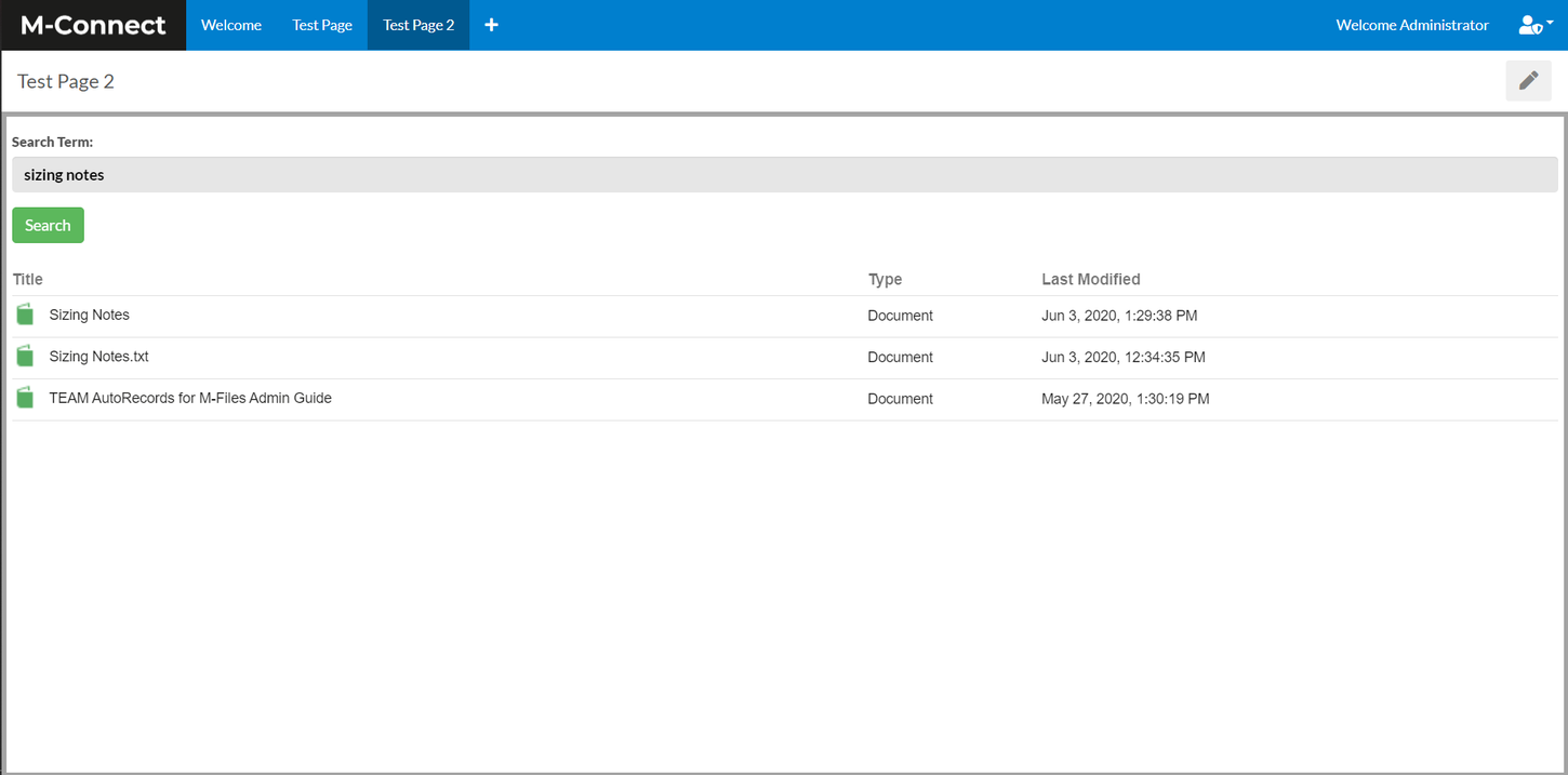
The Search widget is used to perform searches and display content within a full page view or within the Metadata or Viewer widgets.
Edit Widget
The following settings are available within the "Edit widget data" option:
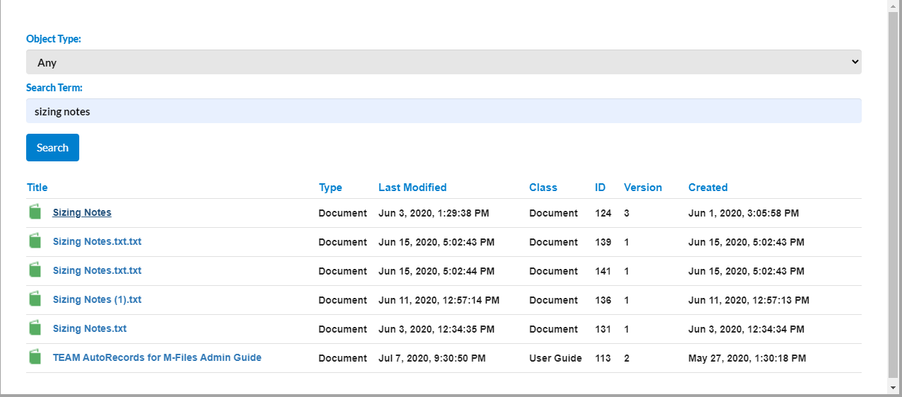
- Show Object Filter - Enabling this will specify if the Object Type dropdown is displayed on the search form.
- Pagination - There are 2 options: Display All Results and Paging. They determine how many items are displayed when there is a large number of results.
- Allowed NACLs - This specifies the Named Access Control Lists that will be used to grant external users read access to documents and objects shown in the Search widget.
- Search Results Limit - The number of items that can be returned in the search results.
- Disable 360 View - Removes the icon that allows user's to see an item's 360 view.
- Enable Automatic Workflow Transitions - Allows a workflow transition to be configured that is automatically performed when an item is opened.
- Workflow - The workflow that items will be automatically updated within.
- Starting State - The workflow state that an item must be in to be automatically updatd.
- Target State - The workflow state that an item will automatically transitioned to.
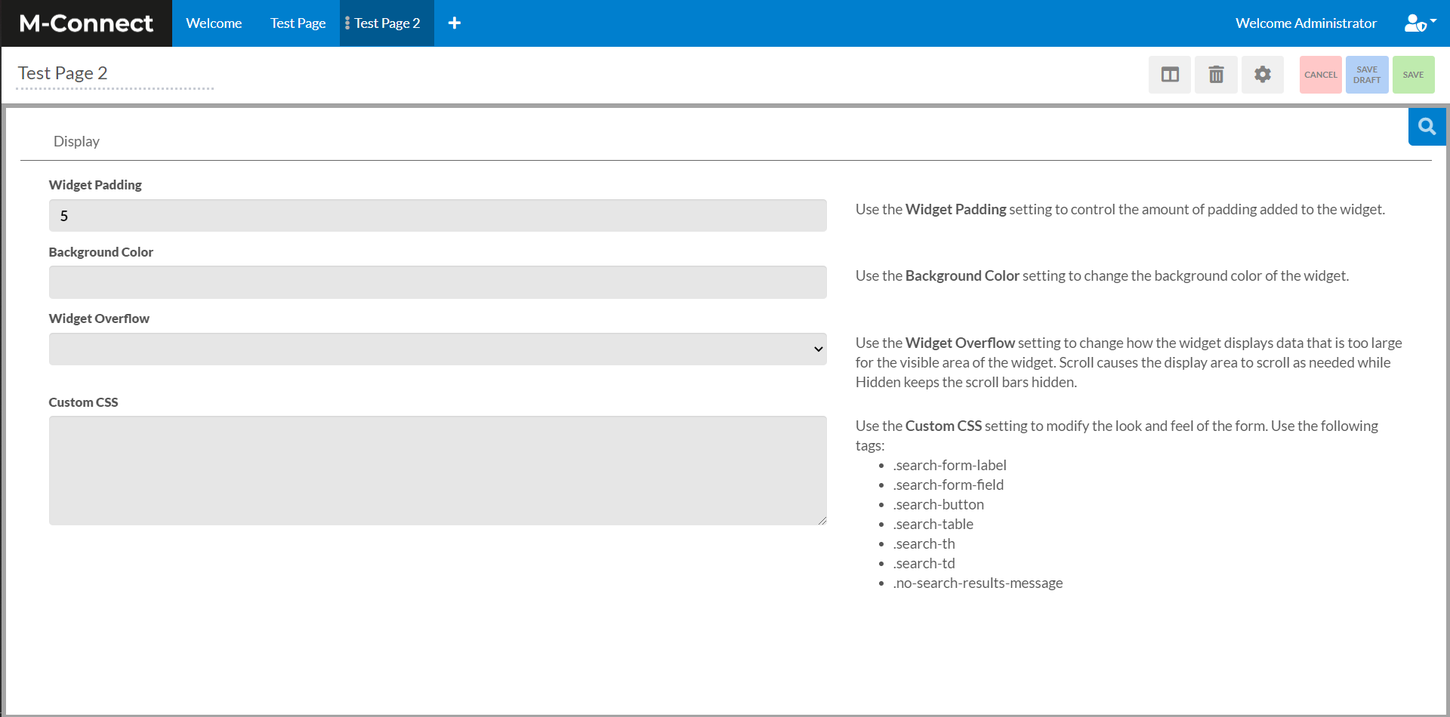
Configure Widget
The Search widget configuration settings include options for adjusting the look of the Search widget by allowing for customization of padding, background color, widget overflow, and custom CSS.
An Example of Custom CSS
.search-form-label {
	color: #007fce;
	font-weight: 900;
	display: block;
	width: 150px;
	float: left;
}
.search-button {
	background-color: #007fce;
	color: white;
	border: 3px solid #007fce;
	border-radius: 4px;
}
.search-th {
	color: #007fce;
	font-weight: bold;
}
.search-td {
	font-weight: bold;
}
.no-search-results-message {
	color: red;
	font-weight: 900;
	font-size: 24px;
}